
Deciding between colour and black and white photography can be a very difficult process. Many photographers struggle in deciding the optimal variation and compromise the quality of their work. Indeed, choosing between monochrome and colours can make a huge difference from a visual point of view.
I have been struggling in deciding the best approach for a long time and still some photographs require a great effort to choose the best processing approach.
Sometimes, the chromatic decision is made even before pressing the shutter. Just think about purchasing a roll of black and white film, using a Leica Monochrome or photographing with the new Phase One IQ3 Achromatic. On the one hand, this simplifies your decision-making during the post processing. On the other hand, it might hit your bank account severely – especially if you photograph with he aforementioned Leica and Phase One.
I would like to share with you a few rule of thumb that I follow in order to decide whether a photograph should be processed in colours on in black and white.
Light Intensity
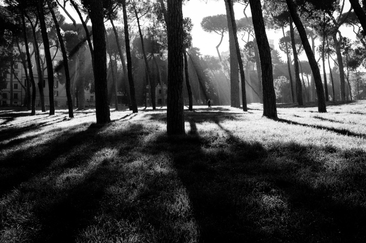
Rome, 2017
As I mentioned in a previous article, shooting at different times of the day leads to very different results. Indeed, light tends to be softer and warmer early in the morning and during sunsets. On the other hand, light is much harsher around midday. When I photograph landscapes and cityscapes, I enjoy shooting when the light is warmer due to the specific look I can achieve in the sky and in the cloud formations.
You might have noticed that a harsher light causes the overall dynamic range of the image to increase substantially. You may have experienced blown out highlights or pin black shadows. This is caused by our camera being incapable to record enough details from the lightest to the darkest areas of the photograph.
Even though I realise that dynamic range might be a problem, I have never stopped photographing because of the excessive light intensity. However, in this case I prefer processing my photographs in black and white. Indeed, I do not like how pin black shadows and blown out highlights are rendered in colour. I believe that they are a distraction, as the viewer has the tendency to focus on the lightest and darkest areas of an image first. On the other hand, the high level of contrast caused by the harsh light might help achieving a characteristic look in black and white. Indeed, monochromatic photographs look much more powerful and appealing if characterised by a strong contrast.
Distractions

Madrid, 2015
As we discussed before, viewers tend to focus on lighter and pin dark areas first, as they look quite unnatural. Similarly, viewers’ attention is caught by vivid colors. Therefore, too many bright colours in an image might represent an unnecessary distraction. In this case, converting the image to black and white might be beneficial to shift the focus back to the main subject of the photograph by nullifying the disturbance of colours.
On the other hand, I would like to highlight that sometimes colours contribute to make a photograph even more interesting. There are several ways to use colours in order to make the image more visually appealing, such as: complementary colours. colour triads and analogues.
Therefore, it is crucial to understand whether colours enrich your photograph or cause viewers to get confused. You can edit correctly only by putting yourself in your viewer’s shoes.
Feelings

Rome, 2015
Obviously, monochromatic and colour photography transmit feelings in quite a different way. Black and white photographs are usually more moody and immediate in transmitting the desired emotion. On the other hand, colour photographs are much richer, more complex and elaborated. It takes me more time to extract a certain feeling from a colour photograph compared to a monochromatic one.
I should probably mention that mastering the art of moving your viewers through a colour image is way harder than achieving the same result in black and white. Indeed, the complexity of colours might hide emotions. On the other hand, the simplcity of monochrome helps to lay the soul of the image bare.
Conclusion
Deciding whether to process a photograph in colours of in black and white is a very hard choice. However, three tips might help you to decide the optimal way. Firstly, you should beware the light intensity. In my opinion, the harsher the light, the better a monochrome editing will work. Moreover, you should understand whether colours enhance the visual impact of your image or confuse the viewer. Finally, be cautious of how a chromatic choice impacts on the feelings transmitted by your photograph.
Once you have thought about these three tips carefullt, just follow your intuition and edit accordingly.

I love black and white photos, there is something about them that draw me in but of course its a personal preference, and what the viewer likes. But (and I am no expert lol) Some photos need that colour, I feel. Like a sunset/rise, or certain flowers, animals, etc. If that makes sense. Either way your photographs are gorgeous 🙂
LikeLiked by 1 person
I completely agree with you. Sometimes colours are important but they have to add something to the photograph. On the other hand, bnw is much more direct and powerful. The choice is really subjective and image dependant
LikeLiked by 1 person
That makes perfect sense but of course it’s way above my pay grade. I am just happy if the pictures I take are in focus lol 🙂
LikeLiked by 1 person
Step by step you will build the confidence to make more complex choices such as bnw conversion. Hope that you will find my other articles inspiring
LikeLiked by 1 person
I’m sure I will. I’ve enjoyed everything I have read, and seen so far 🙂
LikeLiked by 1 person
I usually always try out a few quick monochrome conversions in post-processing to get an idea of which direction I want to head in. I love the drama, texture and toning that b&w can bring to an image, but sometimes it can be the colours that can make an image work. Decisions, decisions…
LikeLiked by 1 person
Thank you for the feedback. Yours is a great approach
LikeLiked by 1 person
Monochrome pictures do work better with the light intensity, however these lights shades the color you need for a better image, and that’s why i prefer shooting on raw+monochrome so that i can easily change it while to colored whenever am indecisive about my shots.
LikeLiked by 1 person
That’s a very similar approach to the one I use and find it incredibly handy. Thank you very much for sharing your thoughts and hope you will enjoy my other articles too
LikeLike
A good exercise for me was to look at my older pictures and try to convert them to black-and-white to see if they worked. Now I know a bit better what can work in black and white before taking the picture. I agree with you that color can be distracting especially with people photography.
LikeLiked by 1 person
That’s a wonderful exercise. I will give it a try as well and see what’s comes up. Thank you for sharing your opinion
LikeLiked by 1 person
I have just looked at a few of your post but enjoyed everyone. I look forward to returning soon. Happy shooting. Brick
LikeLiked by 1 person
Thank you very much Brick! I will keep posting and hopefully you will find the next posts as inspiring
LikeLiked by 1 person
Totally agree with your perception on black and white vs color. I have seen lot of people just convert a color to monochrome for the sake of converting without really understanding the need for conversion.You have explained it beautifully… Thank you
LikeLiked by 1 person
Thank you for commenting. I really appreciate your feedbacks and ideas.
LikeLiked by 1 person
[…] Black and White or Colour Photography? […]
LikeLike
[…] Black and White or Colour Photography? […]
LikeLike
[…] Black and White or Colour Photography? […]
LikeLike
[…] Black and White or Colour Photography? […]
LikeLike
[…] Black and White or Colour Photography? […]
LikeLike
[…] Black and White or Colour Photography? […]
LikeLike
[…] Black and White or Colour Photography? […]
LikeLike
[…] Black and White or Colour Photography? […]
LikeLike
[…] Black and White or Colour Photography? […]
LikeLike
Reblogged this on YET TO BE DONE.
LikeLiked by 1 person
i prefer monochromatic pictures and it makes me focus on the subject that the author intend to us to notice. and it also makes pictures clean
LikeLike
This is definitely one of my struggles. Black and white photography shows emotion and contrast more clearly in some cases while color can help with focus and giving a more playful tone. For some photos both add something to the photo and it’s so hard to decide which tells a better story. Thanks for the tips!
LikeLiked by 1 person
Thank you for sharing your opinion and sorry for taking so long to reply to your feedback. i hope that you will enjoy my latest blog too!
LikeLiked by 1 person
it helped me out a lot :). thank you.
LikeLike
it helped a lot. thank your for it 🙂
LikeLiked by 1 person
Thank you!
LikeLike
Great post! It is always a hard choice. I think you’re right about the way black and white portrays feeling. I think it strips out all the distraction and allows the viewer to focus on the subject. Look forward to your next post 🙂
LikeLiked by 1 person
Thanks for the feedback! I have just posted a new blog after a long absence. I hope you will enjoy it!
LikeLike
[…] Black and White or Colour Photography? […]
LikeLike